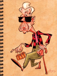

Here's another memory sketch I did recently. We saw this guy coming out of Costcos. Check out the other memory sketches my friends Mark McDonnell and Chad Wood have done over at www.sketchclubeast.blogspot.com. I've included the first quick rough I did, and I felt I wanted to push him a bit more.
cheers
*-!hehe he's real funny!-*
ReplyDeletethe old man is pimping!!
ReplyDeleteThis is great! Thanks for showing the thought process. I like how you reworked the pose. I go to Coscoe all the time, plenty of targets to draw!
ReplyDeletehaven't seen your stuff in a while (holidays). great stuff!
ReplyDeleteGreat stuff Patrick! Nothing like an old guy walking out of Costco. to get the creative juices flowin'.
ReplyDeletewonderful character!
ReplyDeleteThanks for stopping by the blog Patrick! You draw pretty dang funny yourself. I love how your stuff looks with that photoshop/sketchbook background thing you do.
ReplyDeleteThis comment has been removed by a blog administrator.
ReplyDeleteI'm diggin' that jacket. Noyce. What's in the bag?
ReplyDeleteReally Nice work! I've been checkin out your blog for a while now and I love your character design. Keep on posting and much thanks for the comment on my blog.
ReplyDeleteAndrew
Hey Mr morgan- great sketches!
ReplyDeleteAny news on Whaleboy and Sucka?
Nice! I like the old man!
ReplyDeleteCheck the cute girl I draw!:)
Thanks everyone. Hope you all had a great Holiday.
ReplyDeleteSerapio- Which Costcos do you go to?
Boris- WB is going well. We are very hopeful. Printing t-shirts, prints for Wondercon up in San Francisco.
Wynne- How are you? I put a link for you.
He has cool grandpa hair!
ReplyDelete..love age spots too!
Very coooool drawings!! Love the attitude in the character!
ReplyDeleteyou didn't ask but,
ReplyDeletei prefer the first sketch. it holds together as a more cohesive whole. the second version has lost any of the elements which unify the design. his face is curves and loose flesh and his body is suddenly all rigid angles. perhaps, in the clean-up drawing, the transition from body to neck needs some more dramatic reiforcement, to make clear the transition of graphic ideas and structurally to support the head.
it would be interesting to hear your thoughts on what motivates the choices you make in the drawings. i'm guessing the first drawing was quick and in the service of that effort to record your initial immediate responses. which for me, rings more true to the subject-the soft curves, the rounded shoulders, a man worn down by time like a stone in the river. you know what i mean? i know that sounds corny but, again it's just an overall unifying idea-at least as far as i can see.
as i said, would be great to hear your thoughts on drawing.
John, thanks for the feedback my man.
ReplyDeleteWell, the dude we saw was wearing really snazzy sharp clothes, so I keept the clothes kinda sharp and clean. His body on the other hand was wearing down so I tried to go after that idea, where his flesh was showing. The guy didn't look worn down. He actually looked like at one he was a pretty hip Mo-Fo. The first one, just weeked a bit common to me at the time, and I just wanted to push it a bit more. But you really had some good sugestions.
cheers,
Patrick
jCxoHs Your blog is great. Articles is interesting!
ReplyDelete5wchMu Thanks to author.
ReplyDeleteMagnific!
ReplyDeletePlease write anything else!
ReplyDeleteWonderful blog.
ReplyDeleteNice Article.
ReplyDeleteThanks to author.
ReplyDeleteHello all!
ReplyDeletes34gsW Please write anything else!
ReplyDeleteactually, that's brilliant. Thank you. I'm going to pass that on to a couple of people.
ReplyDelete